
01 Oct Metallic & Knockout Label Design: Pro Tips for Bold Packaging
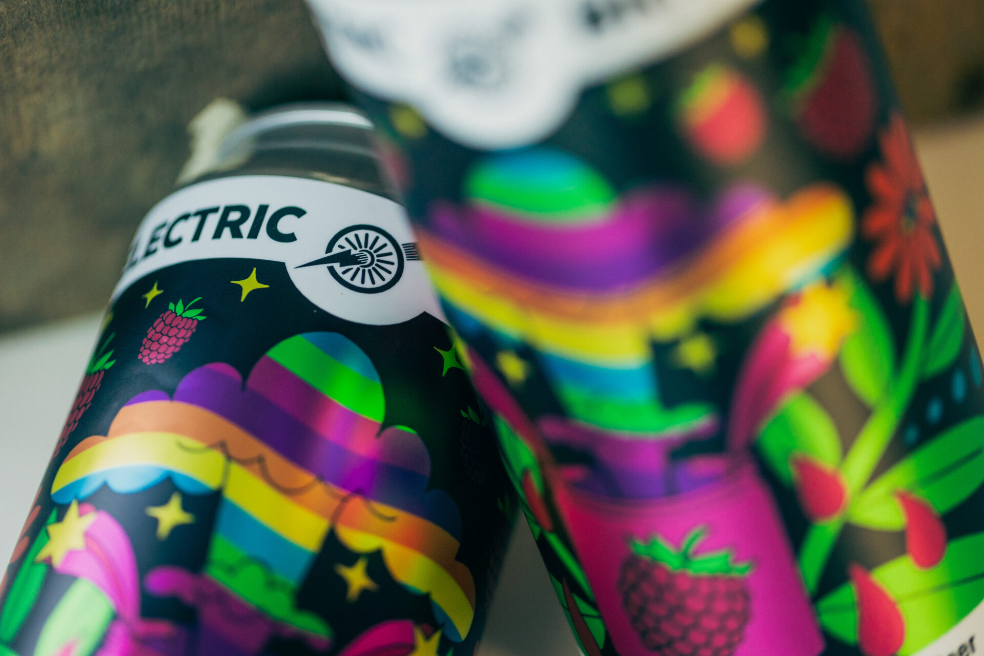
Great packaging design doesn’t just live on a screen—it has to shine (literally and figuratively) once it’s printed. For brand owners, designers, and production teams, the difference between “good” and “great” labels often comes down to how you handle specialty design elements. Metallic effects, white plates, knockout sections, and spot gloss accents can all take a flat design and make it jump off the shelf.
The good news? These effects aren’t just for big brands with giant budgets. With the right design approach and production partner, they’re achievable at almost any scale. In this article, we’ll break down how metallics, white plates, knockouts, and spot gloss can be used effectively—and what to keep in mind to ensure your designs print exactly as you envisioned.
-
Is Metallic Label Stock Worth It?
Our label experts certainly think so! Metallic effects can instantly elevate a label, giving it a premium feel and catching the consumer’s eye in crowded retail environments. Used well, you’ll get that “Oooo!” reaction when customers see your labels—and we all know how good that feels!
How metallics are achieved:
- Metallic substrates (like silver BOPP): The label stock itself provides the metallic sheen. Printed inks on top allow you to control where the shine shows through.
- White plates under metallics: Adding a white ink layer behind certain areas dulls the metallic effect, creating contrast and legibility.
- Spot gloss + metallic combo: Gloss coating can intensify the reflective quality of metallic areas.
Design tip: Don’t use metallics everywhere—reserve them for logos, product names, or background accents. Too much shine can overwhelm the design and end up distracting from your primary focal points.
-
What The Heck Is A White Plate & How Do I Use It?
White plates (sometimes called “white underprints”) are one of the most powerful but misunderstood tools in label design.
Why they matter:
- On clear or metallic substrates, printing directly without white ink means colors will appear translucent or shiny.
- A white plate blocks the background, allowing printed colors to look opaque and true to your brand palette.
- Designers can “mask” where white is applied, strategically mixing transparent, metallic, and opaque effects on the same label.
Practical example: A clear beverage label could use white plates under the logo (so it stays solid and readable) while leaving fruit illustrations semi-transparent for a more organic look.
-
What’s A Knockout Section & When Do I Use It?
A knockout isn’t a fancy embellishment—it’s simply where you don’t print. But when used strategically, knockouts can create striking effects.
A few examples for where knockout sections work great:
- Let the substrate show through: On metallic stock, knockouts let the silver shimmer come through naturally.
- Enhance legibility: Knocking text out of a dark color block onto a white plate keeps it crisp and clear.
- Create layers of depth: Combining knockout areas with spot gloss or metallics creates a sophisticated visual hierarchy.
The key is to plan knockouts early in the design process, not as an afterthought. Consumers in 2025 are increasingly aware of their design preferences and responsive to great design. Wondering what’s new and exciting in label design in 2025? Our 2025 Label Trends article will walk you through what’s currently resonating with audiences.
-
Spot Gloss or High-Build Gloss—What’s The Difference?
Spot gloss is one of the most versatile—and accessible—ways to elevate a label. By applying gloss only to select areas, you can create contrast against matte backgrounds and draw the eye to specific details. The only difference between spot gloss and high-build gloss is the texture. High-build gloss has a more raised texture, whereas spot gloss is thinner. Both emphasize colors and work on label stocks just the same!
Where to use spot gloss effectively:
- Logos or brand names
- Key ingredients or product descriptors
- Background patterns or subtle textures
Because spot gloss doesn’t require embossing or foil, it delivers premium impact without premium cost.
-
Common Pitfalls to Avoid
While these effects can dramatically enhance a label, they also come with potential challenges if not set up correctly.
Watch out for:
- Registration issues: Fine metallic details may not align perfectly—keep metallic elements bold and simple.
- Unreadable text: Metallic text without a white plate underneath can disappear under certain lighting.
- Overcrowding: Using metallics, knockouts, and gloss all at once can make a label feel chaotic. Pick one or two focal effects.
- UPC/ QR codes: Cameras and code scanners don’t always play nice with metallics—best practice is to white plate under those elements to avoid any potential issues down the line.
A good rule of thumb: if an effect doesn’t serve a purpose (legibility, emphasis, storytelling), cut it.
-
My Printer Asked Me To Prep My Art Files For PrintingWhat Does That Mean?
Designing for print requires a little extra prep work compared to digital-only design.
File prep checklist:
- Use layers: Keep metallics, white plates, and spot gloss on separate clearly labeled layers.
- Vector shapes: Define specialty areas with vector paths to ensure crisp edges.
- Communicate intent: Work with your label partner to provide mockups or callouts showing how you want effects applied.
A few minutes of file prep can prevent hours of troubleshooting down the line. If you have questions or want to double-check your artwork setup, feel free to reach out to our team—we’re here to help!
-
What Should I Look For When Choosing A Printing Partner?
The most successful designs happen when creative teams and print providers collaborate early. An experienced partner can:
- Suggest how to balance metallics, white plates, and gloss for maximum effect.
- Recommend substrates (clear vs. metallic vs. white BOPP) based on your brand goals.
- Troubleshoot tricky elements before you commit to a full production run.
This collaboration ensures your bold design choices translate perfectly from screen to shelf.
Metallics, white plates, knockout sections, and spot gloss are powerful tools in the label designer’s toolkit. When used thoughtfully, they add polish, depth, and impact that help products stand out.
For brands, the opportunity isn’t just aesthetic—it’s strategic. These effects can signal quality, emphasize key details, and create memorable experiences that keep consumers coming back.
The next time you’re working on a label, think beyond the flat artwork. Ask: Where could metallics draw the eye? How could a knockout create contrast? What detail deserves a spot gloss highlight? Those small decisions could make the difference between blending in and standing out.
Updated October 2025